
Whether we choose to view the state of the modern American economy through a lens of optimism or concern, one fact remains: over the past several decades, wealth in the United States has grown significantly.
And when the conversation turns to wealth and its broader impact on society, terms like “wealth distribution” and “wealth gap” often come up as well. At our discussion events we’ve heard people arguing that this gap is a natural outcome of individual effort, merit, and risk-taking. Others viewed it as a reflection of structural imbalance or policy failure. So to better understand the scope of the issue, we’ve gathered and visualized key statistics that show how wealth in the U.S. has been distributed for the last 100 years.
As we reviewed the available data, our goal was to understand not only how much wealth exists, but also how it is spread out across different segments of the population. This means looking beyond the headlines and focusing on proportion – what share of the total pie is held by different groups starting from 1925, and how that share has changed over time.
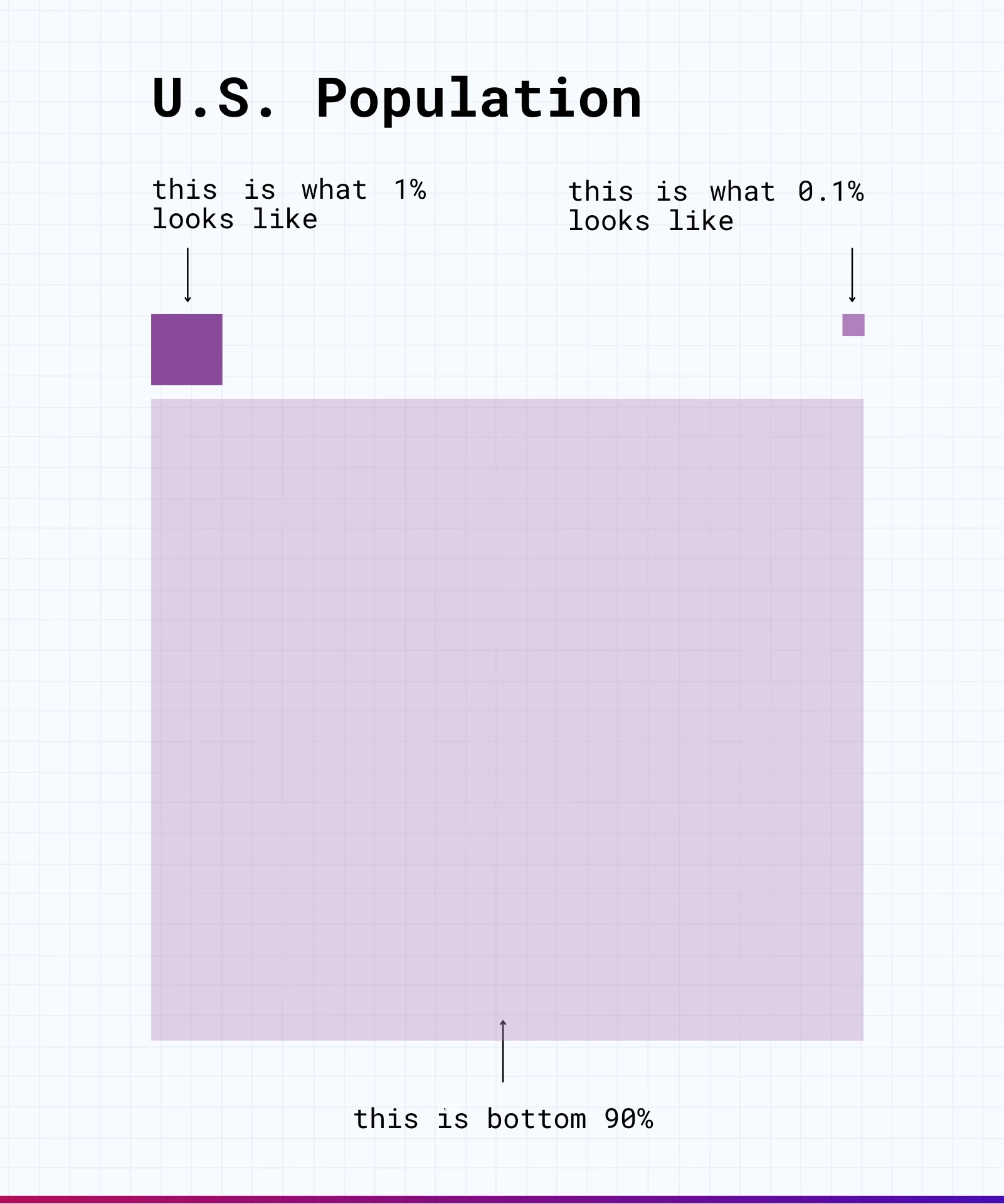
Population Factor
If you recently heard about the wealth of the 1% or even 0.1% in the news, you might have wondered – how big are these groups, really, compared to the rest of the population?
This visual breaks it down. Each square represents the relative size of a population group.
We’ll use this same square system in the next slides to show how wealth is distributed across American households, offering a clearer picture of who holds what.
Broader Look: 100 Years of Wealth in the U.S.
When looking at statistics defining who holds wealth in America, it helps to zoom out, not just across economic classes, but across time. We thought that comparing data from 1925 and 2025 would serve as an eye-catchy and relevant example for both change and continuity in how wealth is laid out by population segments.
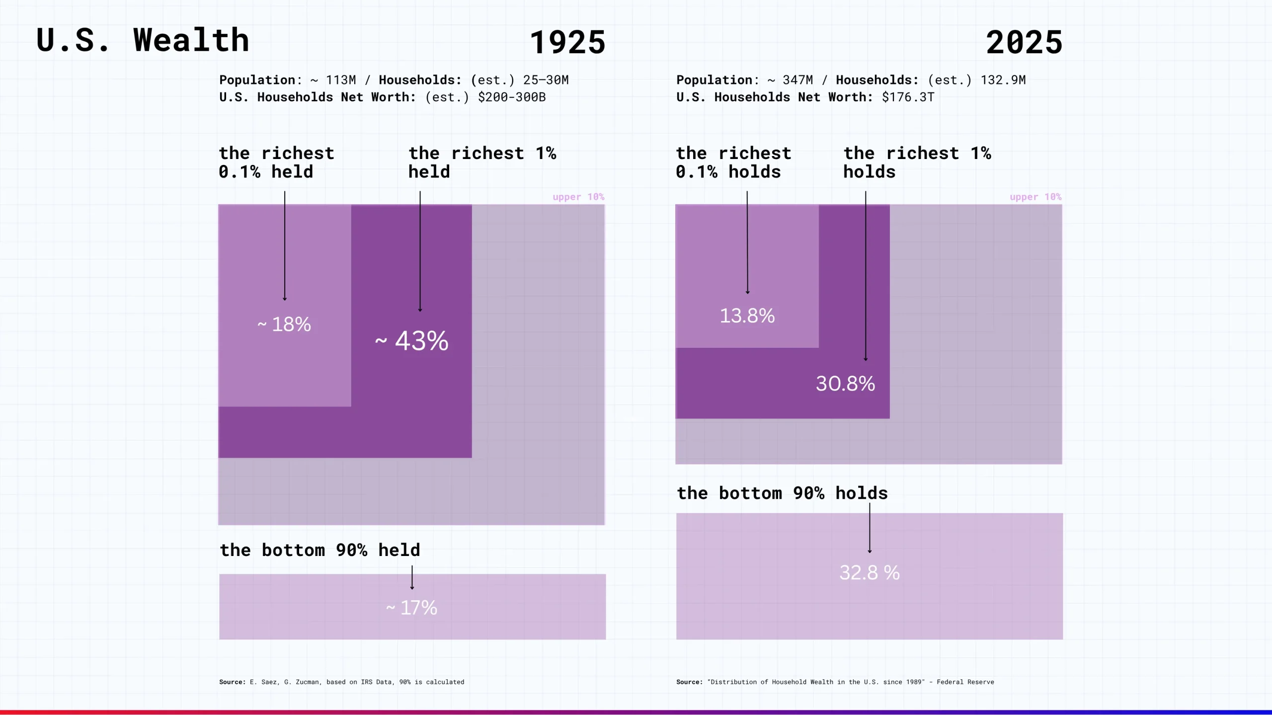
In 1925, the top 1% of Americans held roughly 43% of household wealth, with the top 0.1% holding about 18%. The bottom 90%, by contrast, held just about 17%.
Fast forward to 2025, and while the total wealth has grown enormously (think at least 500x larger), the concentration remains notable. The top 1% now holds 30.8% of wealth, the top 0.1% holds 13.8%, and the bottom 90% holds 32.8% – a larger share than before, but still modest when compared to their majority in population size.
So while the wealth share of the broad population has improved in relative terms, the scale of concentration at the top remains a defining feature of the U.S. economy.
Wealth is Equalizing?
At first glance, it might seem like we’re moving toward a more balanced distribution. After all, in the most recent snapshot, the bottom 90% holds more wealth than it did 100 years ago. But the longer view tells a more complex story.
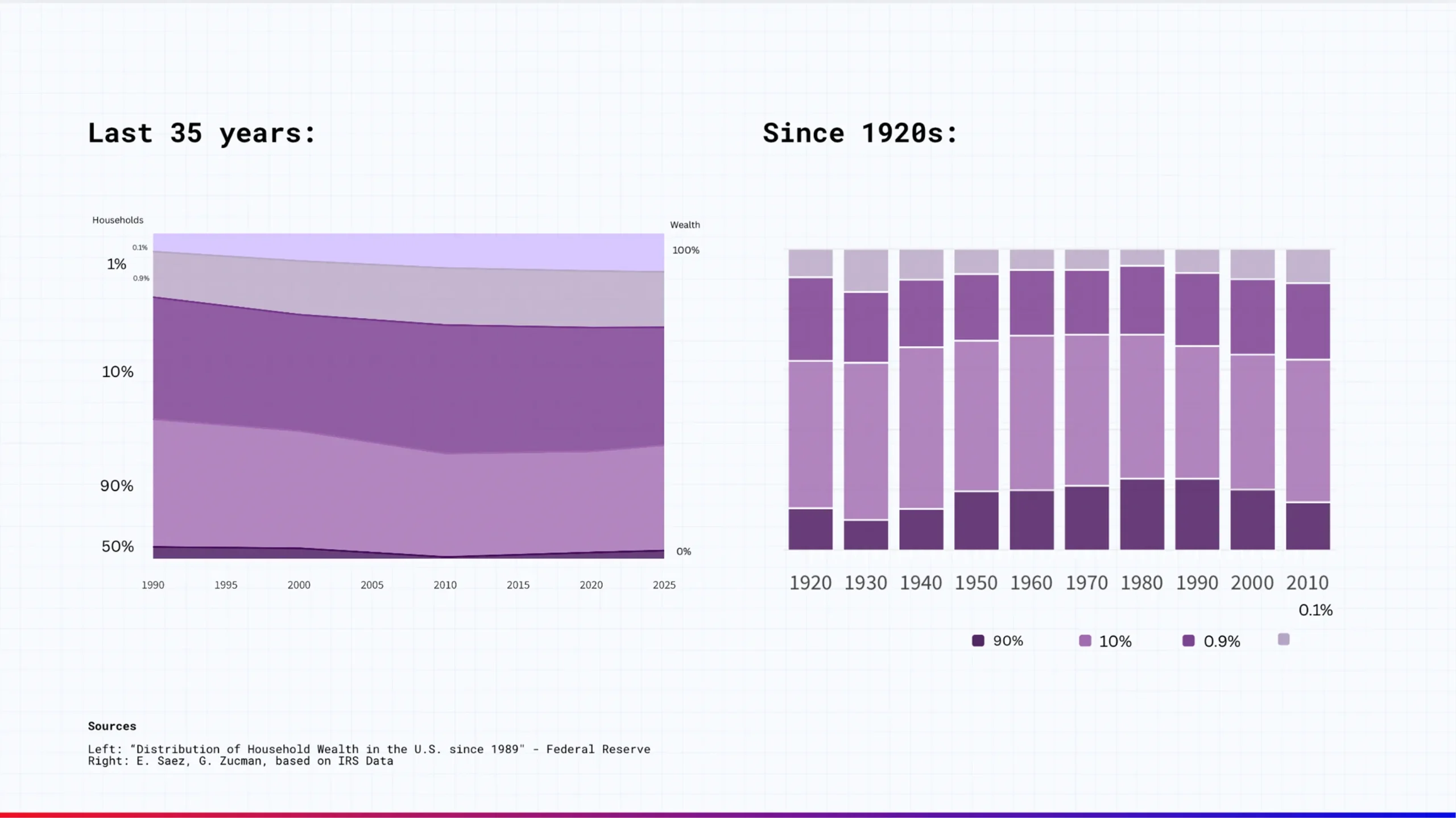
The last 35 years show a gradual but steady trend:
- The top 1% and 0.1% have gained ground.
- The 90% majority, though larger in size, has seen its share dip slightly.
The broader timeline since the 1920s highlights something interesting:
- From around 1950 to 1980, wealth became more evenly distributed.
- But starting in the 1980s, that trend reversed—and the wealth share of the top 1% began climbing again.
This suggests that while some groups have made gains, the overall pattern of wealth inequality hasn’t disappeared. It simply shifts over time, often in response to broader economic forces, policy changes, and structural trends.
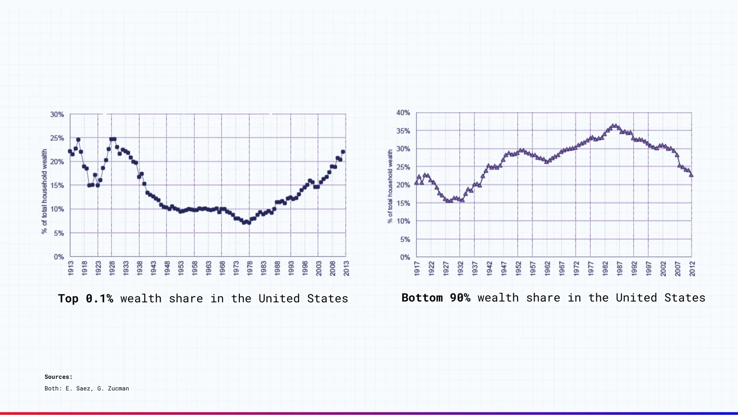
These two charts track the wealth share of the top 0.1% and the bottom 90% of U.S. households over time. And the curves bend in nearly opposite directions. The curves reflect larger forces at work: tax policies, labor power, globalization, the rise of finance, and changes in how wealth is generated and held.
So that’s Definitive Confirmation of a Wealth Gap?
Not exactly. At least, that’s not what we set out to decide for you.
Our goal wasn’t to draw conclusions for you, but to present a clearer picture of how wealth has shifted over time. Using publicly available data from sources like the IRS, the Federal Reserve, and established economic models, one thing is evident:
A relatively small share of the population holds a significant portion of the country’s total wealth – and that has measurable effects on the broader economy.
Join the conversation